5 Colour Mistakes I See Most Often
.JPG)
Choosing colours for your home can feel exciting, but also overwhelming. With so many options, it’s easy to fall into common traps that can make a space feel off-balance, underwhelming, or just not “you.”
In my Colour Therapy consultations, I often see the same mistakes come up time and again. Here are five of the biggest ones - and how to avoid them when making decisions for your own home.
1. Playing It Too Safe with Neutrals
Many people stick to beige, grey, or white because they feel safe and easy. But when every wall, sofa, and curtain blends into the same tone, a room can lack depth and personality. Neutrals work beautifully when they’re layered with texture or paired with accent colours that bring life to the space.
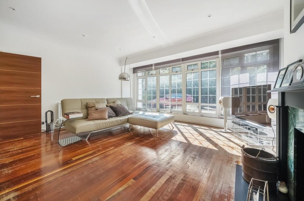
2. Forgetting About Natural Light
A paint colour that looks perfect in the shop (or on Pinterest) may look completely different in your own home. Light direction, the size of the windows, and even surrounding greenery can all change how a colour appears. Ignoring this is one of the biggest mistakes I see. Always test samples in your space, and check them at different times of day before committing.
3. Choosing Colours in Isolation
It’s tempting to pick a colour you love for a wall, cabinet, or sofa without considering the bigger picture. But colour doesn’t live in a vacuum - it needs to work with flooring, furniture, and the rest of your home. A shade that feels perfect in the pot may clash with your oak floors or cool-toned countertops. Always think of your colour choices as part of a whole scheme.
4. Overlooking Undertones
That “perfect” grey might actually have a blue, green, or purple undertone hiding beneath it. Undertones are what can make a colour look fresh in one setting and cold in another. I see this mistake often when clients feel frustrated that their walls don’t match their vision. Learning how to spot undertones is key to choosing colours with confidence.
5. Following Trends Instead of Your Own Style
Trendy shades (hello, millennial pink or sage green) can be fun, but they may not feel timeless in your home. I often see people regret choosing “of the moment” colours that don’t truly suit their taste or architecture. Your home should reflect you, not the latest Instagram trend.
Ready to Choose with Confidence?
If any of these mistakes feel familiar, you’re not alone! That’s exactly why I created the OAT Interiors Colour Guide - to help you avoid costly errors, reduce decision fatigue, and design your home with confidence.
👉 Download your free Colour Guide here and take the guesswork out of choosing colours that work beautifully in your home. https://oat-interiors.kit.com/colour-guide
