Why Understanding Colour Can Transform Your Home – and Your Life
In interior design, colour is often seen as decoration – a finishing touch.
But in reality, it is one of the most powerful tools we have for shaping notjust how a home looks, but how it feels and functions.
The colours that surround us influence our mood, energylevels, productivity, and even our sense of space. When chosen with intention,they can create harmony between architecture, light, and lifestyle. When chosen without consideration, they can feel jarring, unbalanced, or simply “not quite right” – even if you can’t put your finger on why.
The Power of Colour in Your Home
- It Shapes the Atmosphere
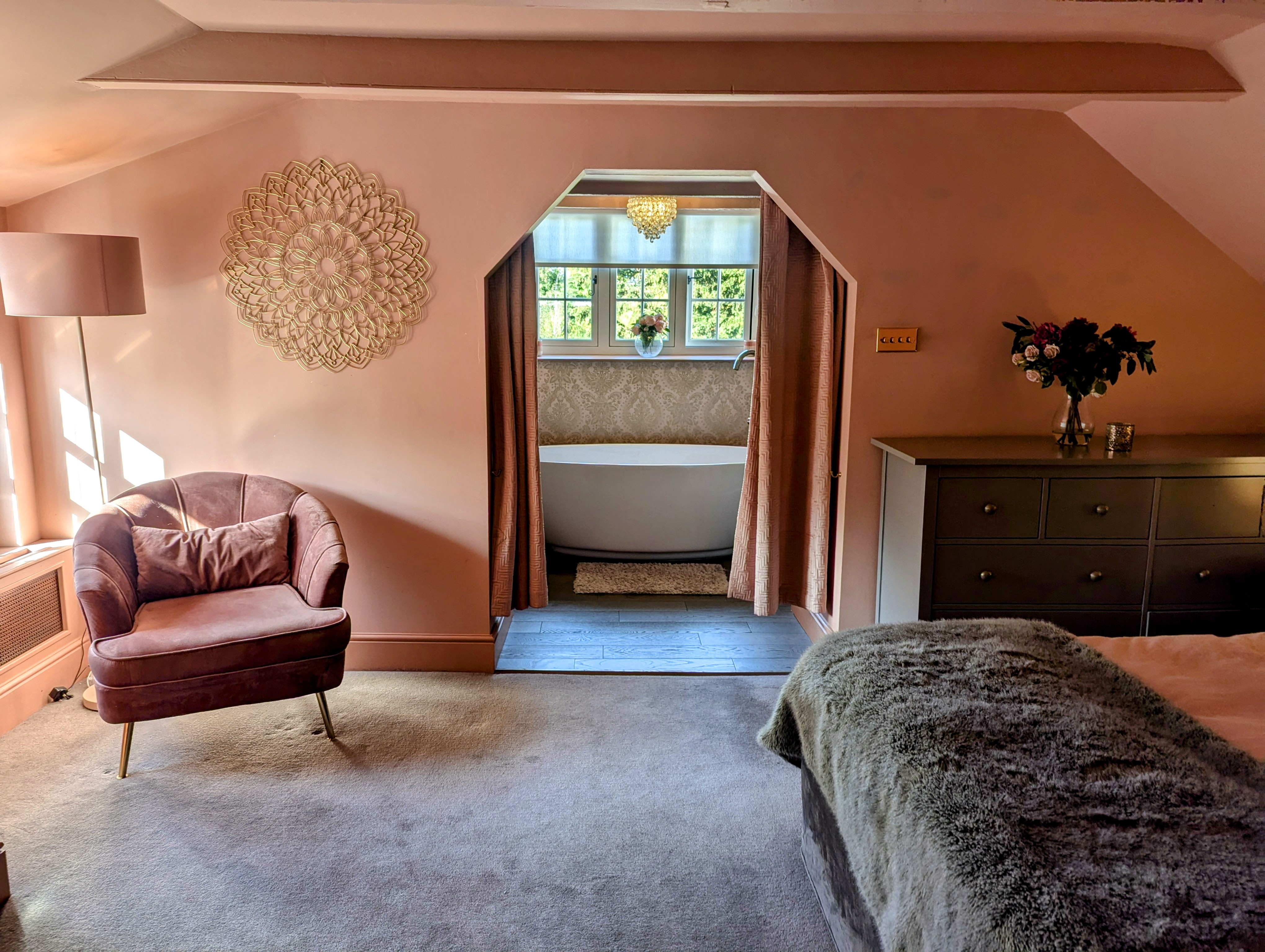
Warm, golden tones can make a space feel welcoming and social, while cool, muted shades bring a sense of calm and reflection. Your palette sets the emotional tone for each room before a single piece of furniture is placed. - It Influences How You Feel
We respond to colour instinctively. Blues and greens can lower stress levels; yellows and oranges can lift the spirit. The right hues can make mornings brighter, evenings more restful, and moments at home more intentional. - It Works with (or Against) Your Light
Natural light changes throughout the day - and it can dramatically alter how a colour appears. A north-facing room’s soft grey can feel sophisticated in the morning but cold by evening unless it’s balanced with warmth. Understanding this interplay is key to making colour last beyond the swatch. - It Connects Spaces
In homes with open-plan layouts or adjoining rooms, colour is the thread that can tie spaces together or mark clear transitions. A considered palette creates a sense of flow and cohesion that feels effortless.
Why Many Homeowners Struggle with Colour
The sheer number of paint options, the unpredictability oflight, and the complexity of undertones mean that choosing colour can feeloverwhelming.
It’s easy to:
- Fall in love with a shade on Instagram only to find it looks completely different at home.
- Choose “safe” neutrals that leave a room feeling flat.
- Overlook undertones that clash with existing finishes.
Without a clear framework, decision fatigue sets in - andoften, the result is compromise rather than confidence.
How the OAT Interiors Colour Guide Helps
The OAT Interiors Colour Guide was designed to takethe uncertainty out of choosing colour, giving you the tools to make decisionsthat feel as good as they look. Inside, you’ll find:
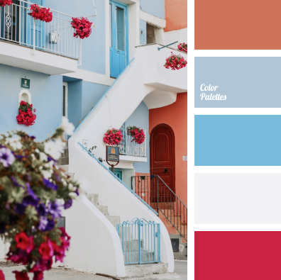
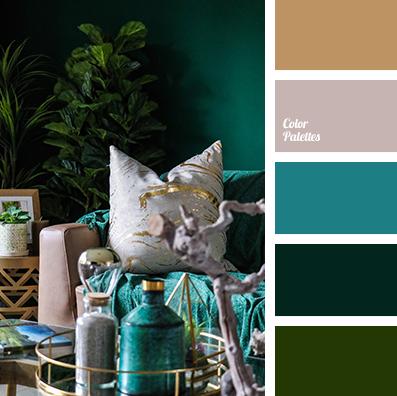
- Colour Psychology Insights – Learn how each shade influences mood, energy, and atmosphere.
- Lighting Guidance – Discover how orientation (north, south, east, west) changes the way colours appear, and how to choose accordingly.
- Undertone Clarity – Master the art of matching undertones to your flooring, furniture, and finishes for a harmonious look.
- Proportion & Scheme Building – Use professional techniques to create balanced, layered colour schemes.
- Common Mistakes to Avoid – Avoid the costly errors most people make when selecting paint.
Whether you’re refreshing a single room or planning awhole-home palette, the guide empowers you to choose colour with intention- reducing costly mistakes, avoiding decision fatigue, and helping you design ahome that reflects your personality and supports your lifestyle.
The Lasting Impact of Choosing Well
When your home’s palette is thoughtfully chosen, it becomesmore than a backdrop. It works in harmony with light, texture, and function tocreate spaces that welcome, restore, and inspire you every day.
Colour is not just visual — it’s emotional, practical, anddeeply personal.
And once you understand its power, your design decisions will feel less likeguesswork and more like artistry.
📖 Start your colour journey today - Download the OAT Interiors Colour Guide and discover how to transform yourhome with confidence and intention. https://oat-interiors.kit.com/colour-guide